Zeit – UI/UX
During my studies at DESIGNLAB, I was assigned to do a responsive website. There were three productsto choose from; retail, insurance and travel.
In this day and age travel products are abundant, but this one in particular was unique – it had no prior reference to be studied. It needed to be developed from scratch and had a twist – the potential to make some of the most far–fetched dreams come true.
Company Background
Zeit is a time–travel subsidiary company under Richard Branson’s Virgin empire. In 2021 Brussels announced the International Concordance on Time Travel, giving Zeit (the first of its kind), the green light to operate under their standards. 229 worldwide destinations open to receive visitors anywhere from prehistoric times to today. Time travelers will only be taken to selected destinations which have been carefully controlled and extremely protected.
My Role
I was in charge of conducting extensive research as well as lead UI/UX designer for this project that took about 10–12 weeks to complete.
Doneness
Create a bespoke brand experience reflecting both present and past. Allow the brand to generate credibility, trust and excitement of a new way to experience travel. Additionally, create an e-commerce responsive website that met the needs of the most critical of travelers to purchase travel packages and tickets to different times in history.
Tools I Used
Sketch
Figma
Adobe Photoshop
Adobe Illustrator
Competitive Analysis Research
Seeing the project unfold was fascinating. I started out by conducting research interviews with 3 seasoned travelers. Examples of my inquiry include how each participant planned and booked travel, blogs and magazines they reach for, activities they look forward to, traveling style, to how they decide the length of their vacation.
Findings
Similarities and differences in planning for travel
What experiences were most important
How different web tools were used to book travel
Views on time travel, what would spark their curiosity to go back–in–time
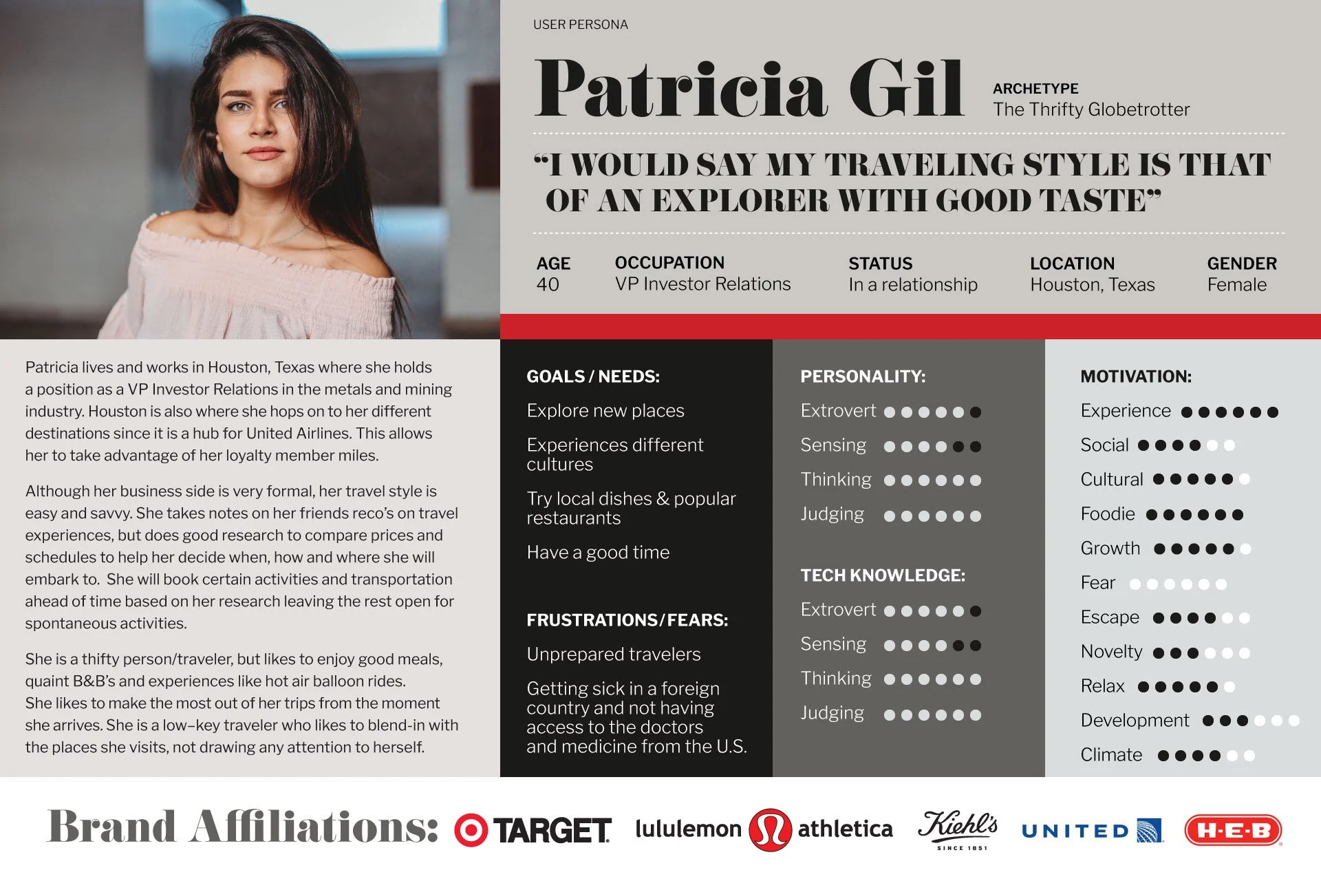
Develop my User Persona
What surprised me the most from this project was the amount of research I had to conduct. I now know how it all sets up the product to be successful and have the opportunity to create an optimal user experience. I enjoyed conducting the different types of research. My favorite – developing the user persona.
Findings
An open and excited approach to traveling back in time.
Some hesitancy about safety or not having access to current healthcare, but had more excitement overall.
A lot of interest to being around groundbreaking times in art history
Prefers to do all traveling coordination in one place.
My persona is open to travel back–in–time as long as safety is guaranteed. She will rely on word–of–mouth and reviews before booking any travel experience. Loves the convenience of a one–stop–shop. When traveling she looks forward to experiencing different cultures, exploring new places, have a good time and trying local dishes as well as popular restaurants.
Defining the Project
After defining business goals, user needs and technical needs, I conducted a card sorting exercise to helped me understand how different people group different times in history.
The time to start creating sketches of what this website could look like finally arrived! I started to visualize different layouts while taking into consideration all the research behind.
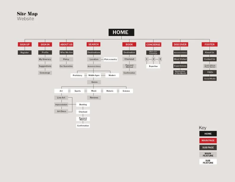
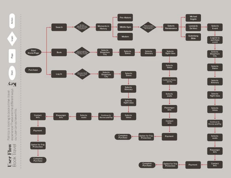
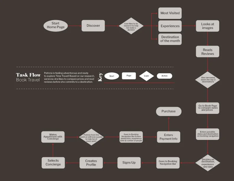
At this stage a site map, site map task flow and site map user flow were also expanded.
Moodboard
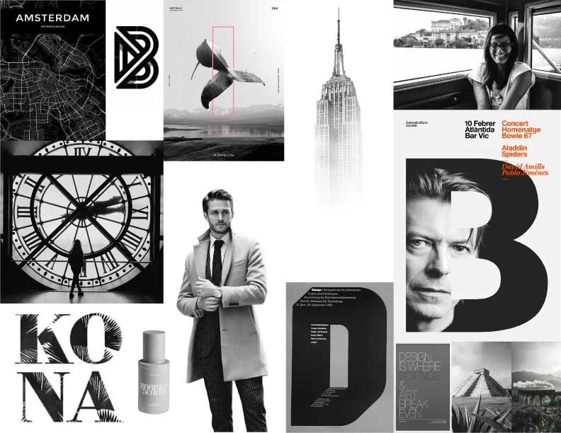
I visualized impactful black and white imagery which would draw the user to further explore the site; speaking to the elegance and experience of the product. The past is in black and white, the present is in color. Using unique typography, like high-end luxury brands in Vogue magazine allow for a tailored look and feel. The user, when navigating Zeit will immediately feel transported to a different space in time.
Around this time I decided to add a concierge feature to the site. Zeit is a luxury product, high end features are part of the experience. This product is so new, guidance and safety are a must. The concierge should be able to be easily reached on the site at all times. My goal; to develop an easy yet effective booking process flow.
Wireframes
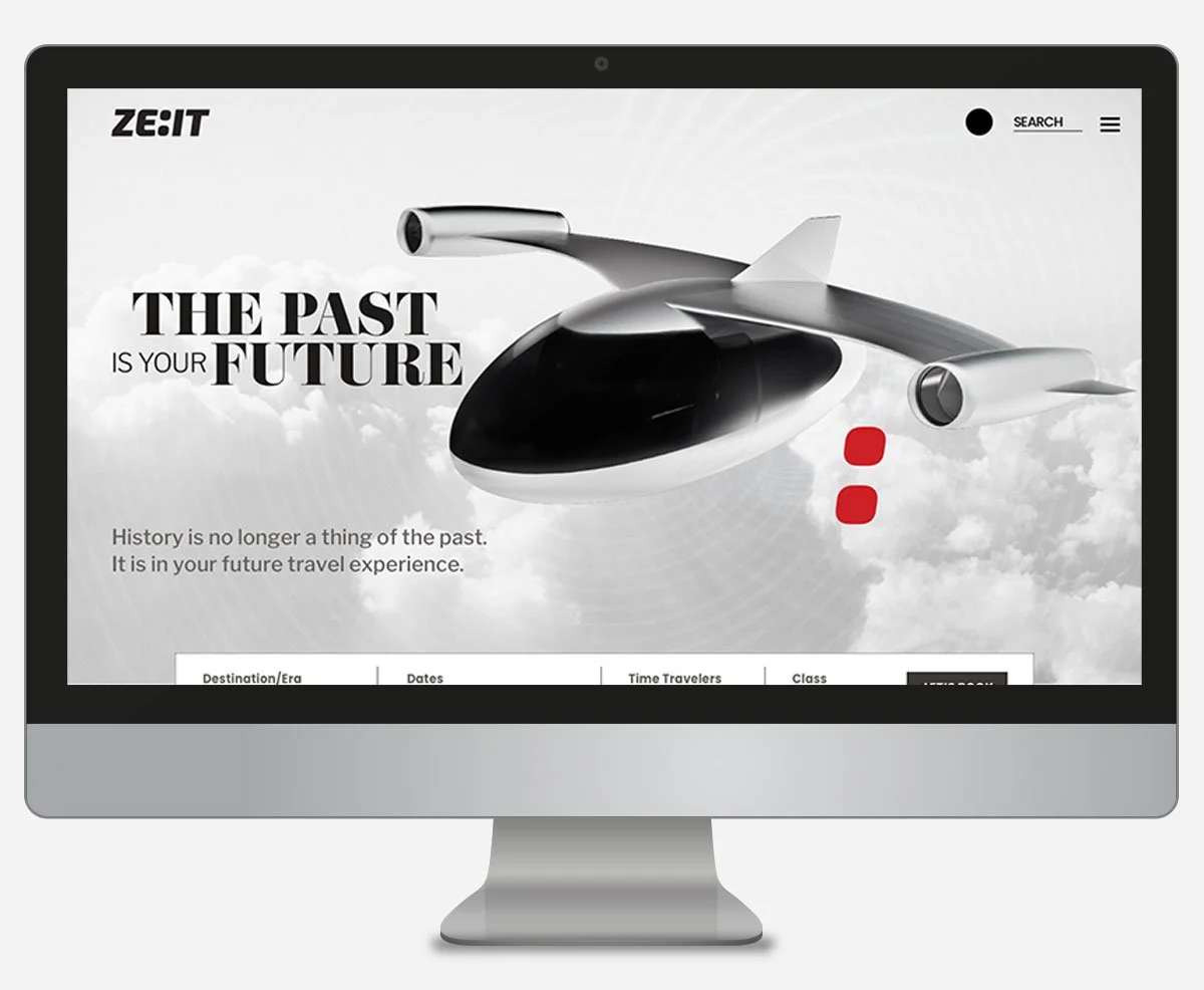
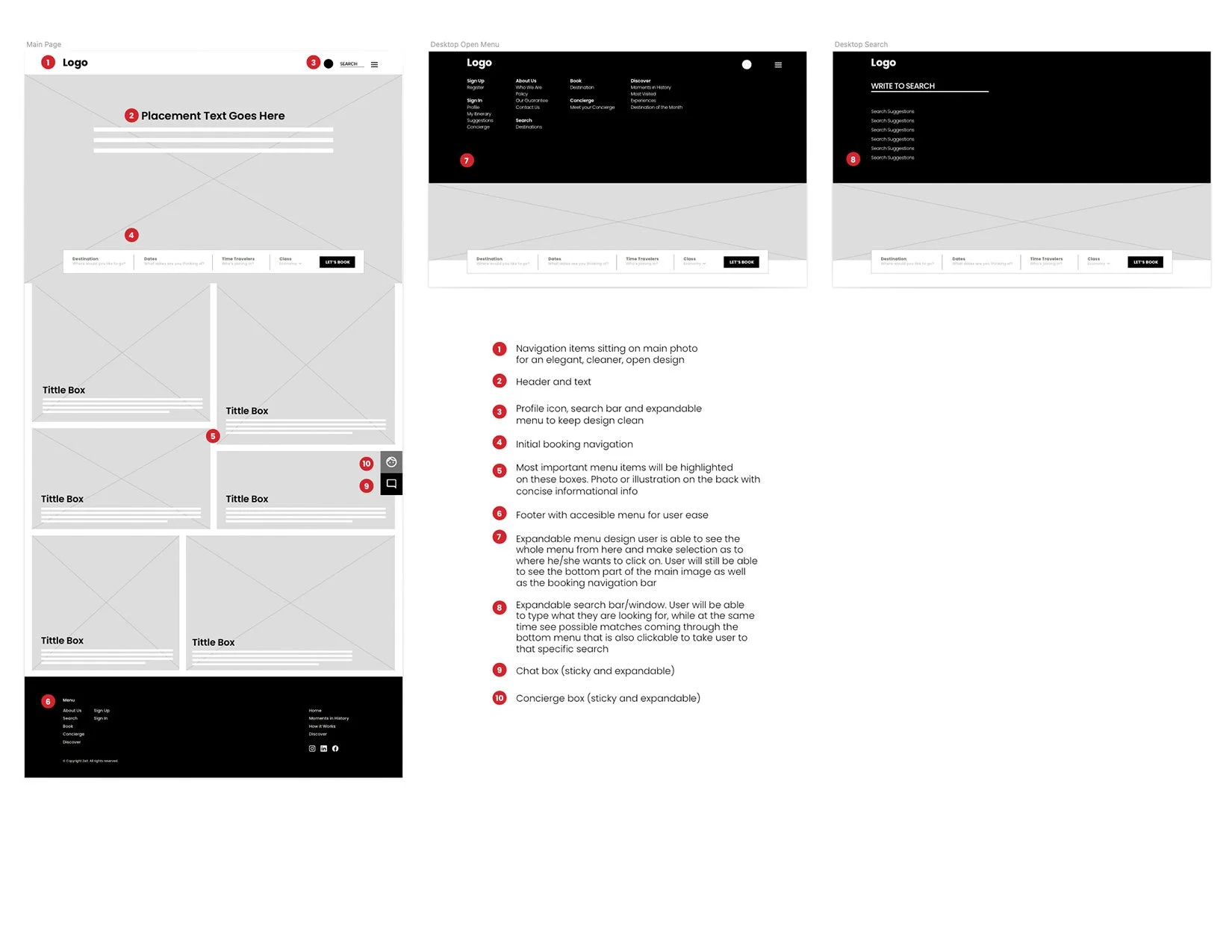
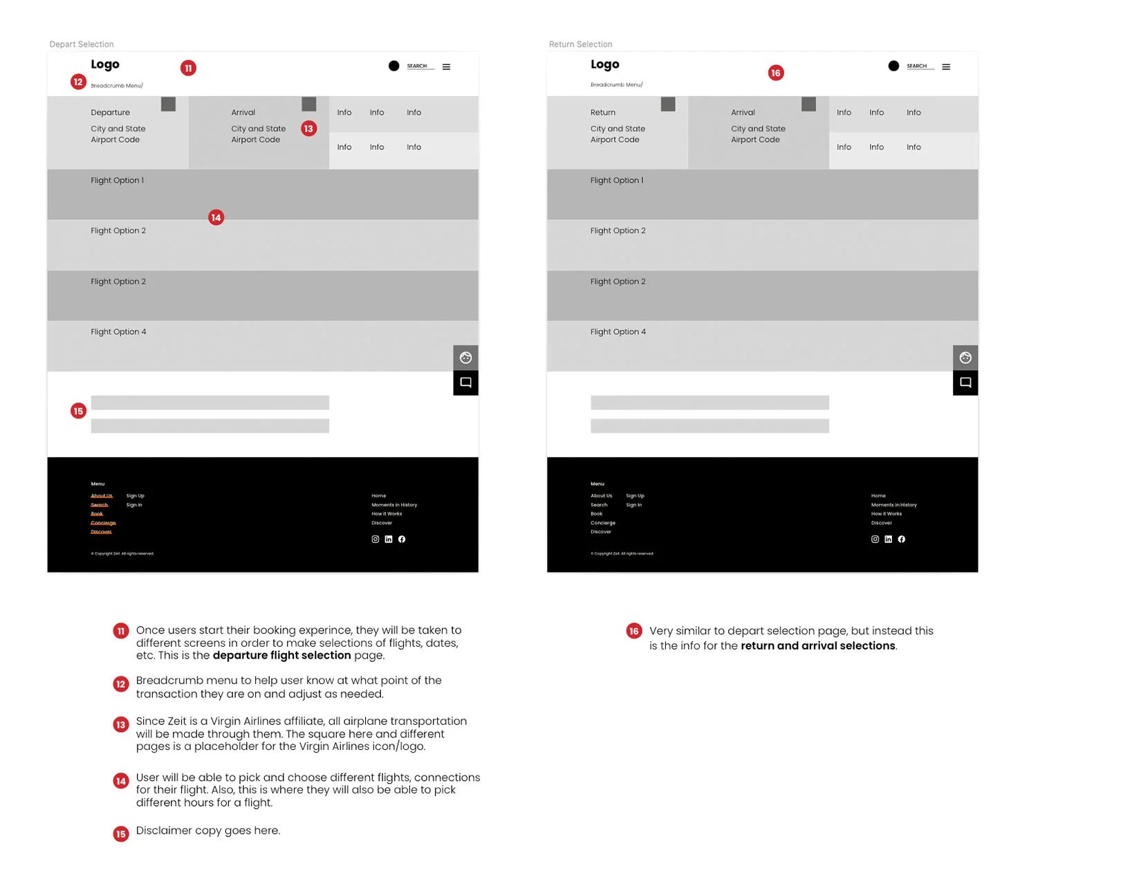
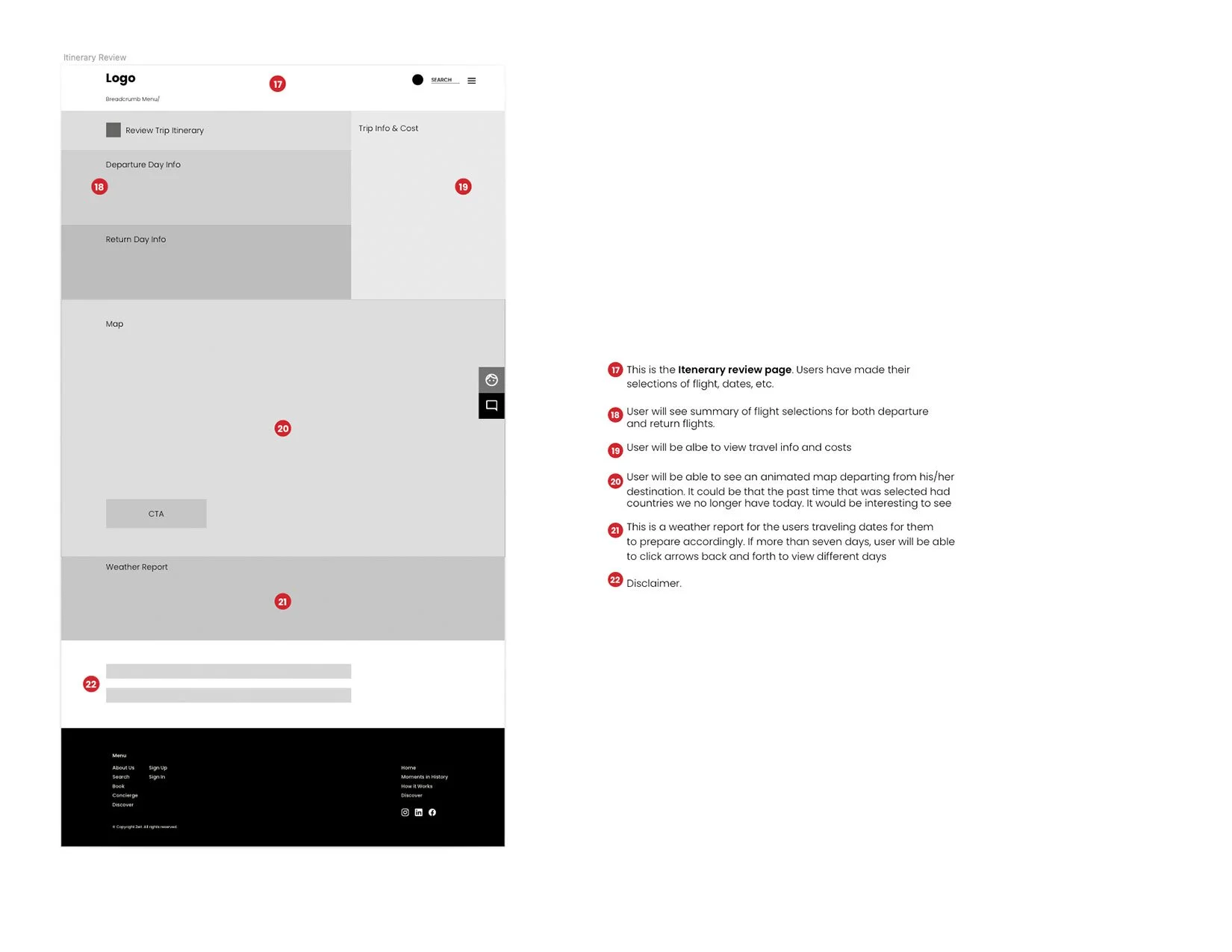
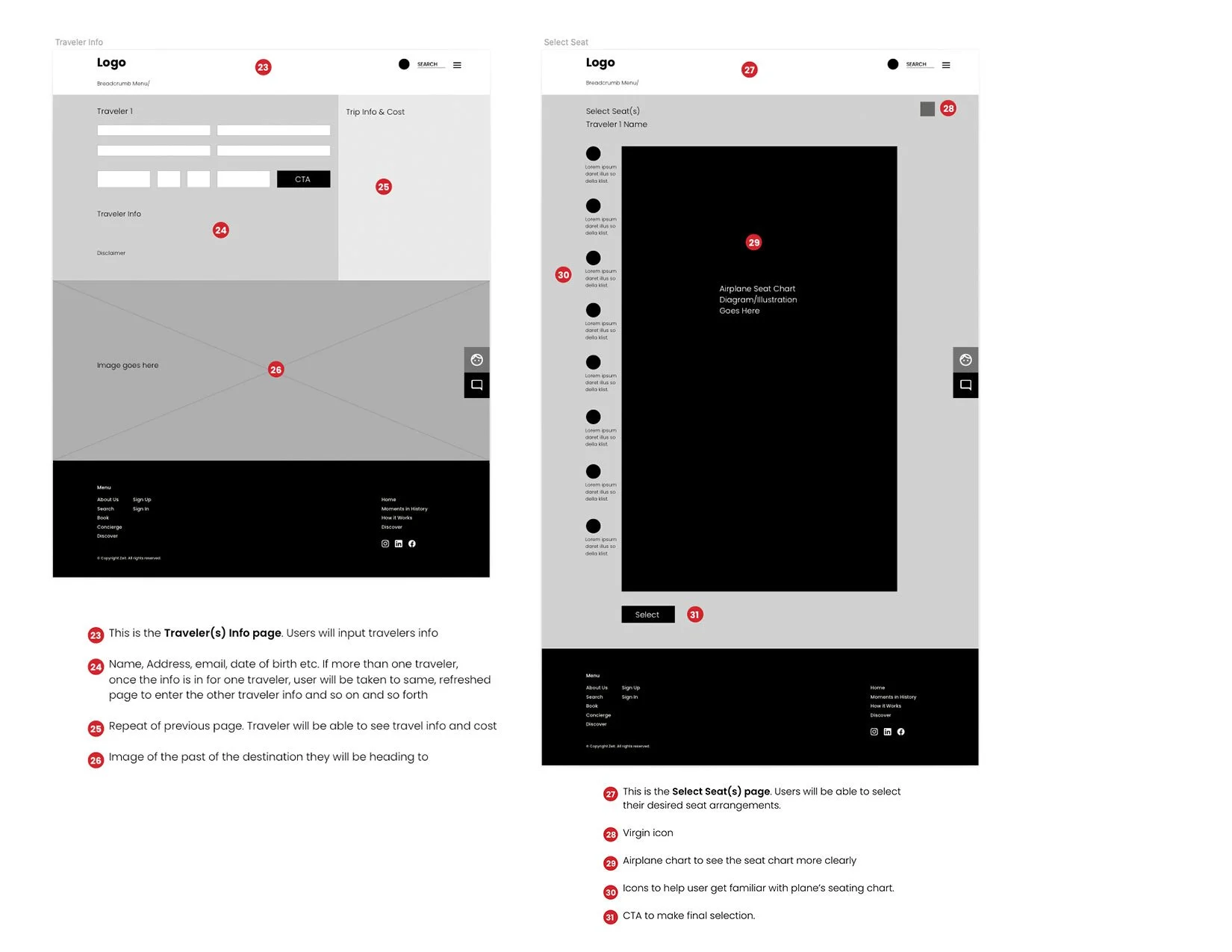
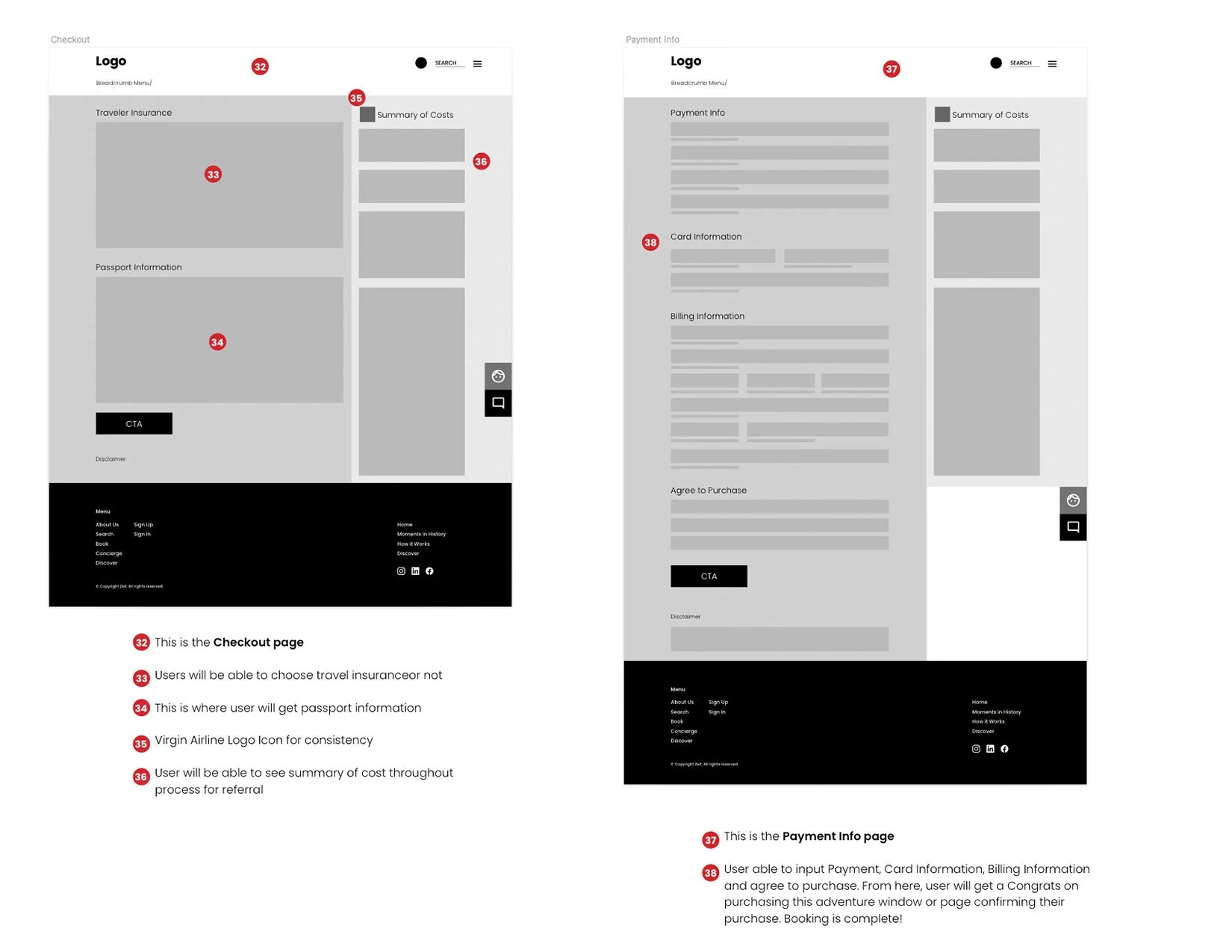
It was very exciting to get to set the digital foundation of the soon-to-be responsive website! I visualized having the navigation items sit on the main photo for an elegant, clean and open design. The expandable menu allows the user to see the bottom part of the main image and well as booking navigation bar at all times. At this stage I resolved how the concierge feature would work. A sticky and expandable box ready for the user at all times. The expandable search bar/window and booking experience flow was also developed. I made sure I added Virgin Airlines branding. I accounted for the summary of travel, information that will be displayed along with Insurance and passport information, seating flow chart, checkout page, payment info and footer.
Logo Development
After the mood board was successfully completed. I proceeded to design the logo. I went the route of writing down a list of words associated with the brand would be the best approach for this assignment. From the list I came up with, I selected the top 3 words that resonated the most with the brand.
Time
Glamourous
Wanderlust
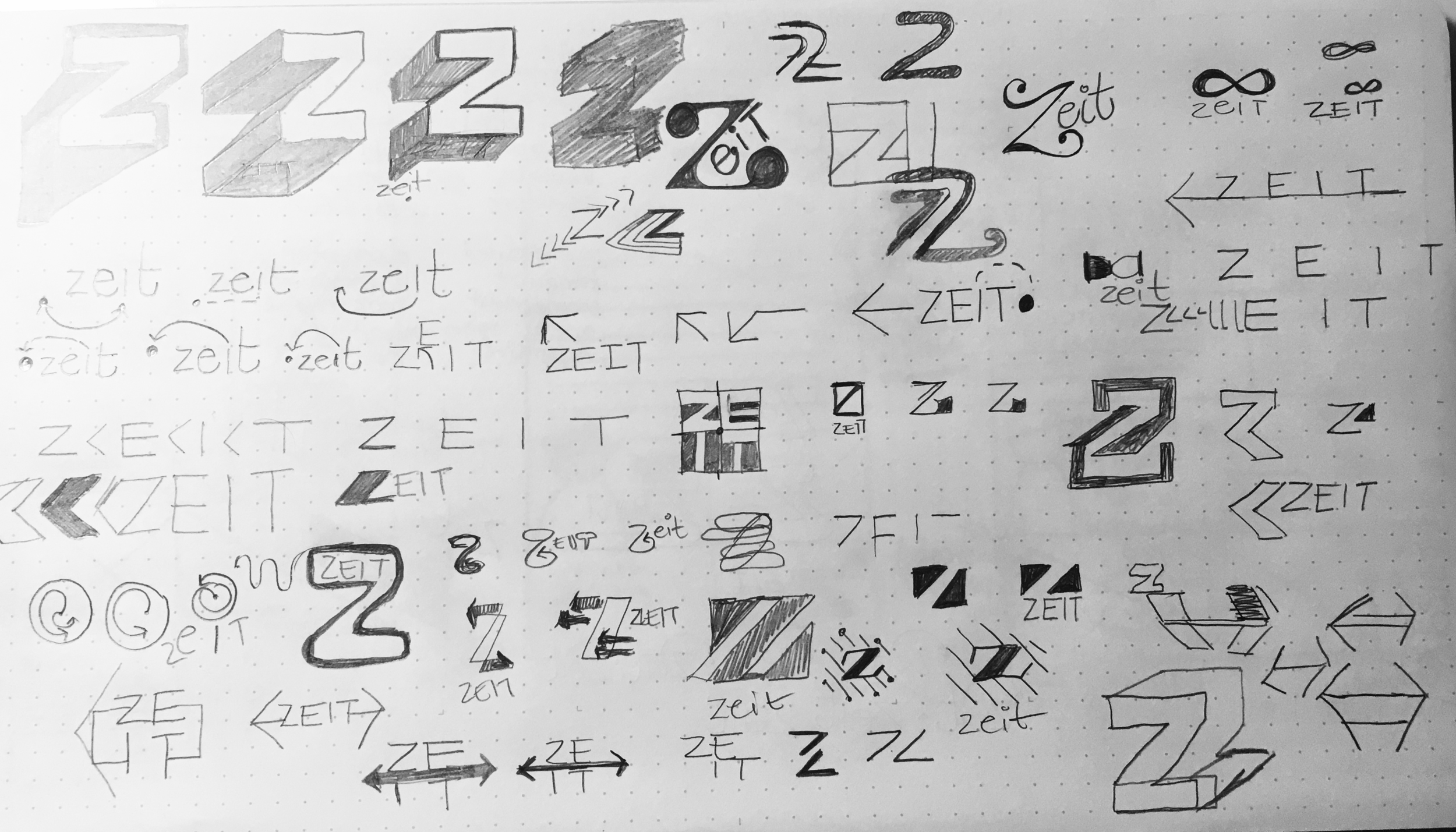
These characteristics needed to encompass the logo. I drafted different versions.
The final logo is modern yet classic, which was exactly my aim. The word Zeit is divided in half by time dots. Just like what you see in an electronic clock. Also symbolizing a before and after. The design resulted to be a bold, elegant mark made up of strong, clean typography. If you look closely the logo it is slightly slanted. Representing the movement of time–travel.
UI Kit
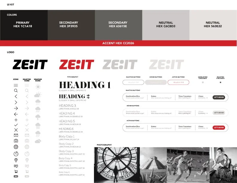
The color palette is reminiscent of old sepia photos. The warm tones speak to the melancholy the past can make us feel. As an accent color I chose red to speak to its subsidiary Virgin Airlines.
When developing this kit I knew that it had to be super clean. This is where I will add contemporary touches of our current digital life with modern icons, rounded buttons allowing for negative space.
I choose EloquentJFSmallCaps a bold serif font for headers and Libre Franklin for all other font usages. This combination speaks to the past and present. Modern and classic.
Prototype
You know the saying, “a painting is never done”? I felt this way with this project. As I kept forward, more ideas came to me which helped enhance the experience.
I added a weather feature on the itinerary page. I figured users need to know how to be fully prepared for climate. I went ahead and googled weather for the Eiffel Tower opening day, which got me thinking about clothing. What will our users wear? I concluded clothing would be part of the preparedness phase upon arrival at Zeit headquarters in Germany. There are a lot of fun details to consider for this new product!
Summary
Zeit being my first fully developed UI/UX design project, I walk away with an array of new knowledge! I was very surprised to see how much research and research methods go behind the launch of a product. It truly was a fascinating learning experience to see how every step works like compound interest.
Next Steps
Conduct another round of usability testing based on user feedback
Fully develop the concierge feature
Fully develop travelers reviews and experiences to be a stand-alone feature
Prepare a proper hand-off to developers
Design advertising campaign for Zeit to increase sales
Thank you for your interest in my case study and for making it this far.

