InCompass is the newly branded annual 4–day convention by Insperity, for Insperity employees. A pretty big deal! The marketing and events team come together all hands on deck to ensure the 3,000+ employees have a successful experience whether virtual or online.
In-person guests arrive to downtown Houston to kick–off the year. The CEO and leadership team deliver nothing short of inspirational and informative messages. Attendees never have a dull moment. They enjoy an array of events like breakout sessions, networking, mentoring, live entertainment, top-notch food and snacks, sit–down meals and the most awaited awards ceremony honoring the hardest working employees.
Additionally, Insperitans get to enjoy key note speakers in the likes of U.S. Olympian gold medalist Kerri Walsh and Shark Tank's Daymond John drop in to deliver thought provoking talks. It’s a great place to be, come together and live the celebration.
Since 1986 Insperity has been showing companies how to harness the power of HR to improve business success to small and mid-size companies across the U.S. It has 80+ offices throughout the country with 3,000+ employees.
Mission Statement:
The mission of Insperity is to help businesses succeed so communities prosper.
Insperity believes the company’s workplace culture and brand are permanently linked. When addressed simultaneously the two make a beautiful symbiosis. The culture can drive your brand and make a solid foundation. Their annual conference is a celebration for their employees and their accomplishments. Employees walk–out feeling inspired, empowered and with a great sense of belonging.
My Role
As a Senior Visual Designer for the Marketing Ops dpt. I was given the lead to this super fast–turnaround project. It took about 15-20 hours to design, complete and submit final high fidelity files.
Doneness
Drive employees to register for event whether virtual or in-person
Create a responsive website
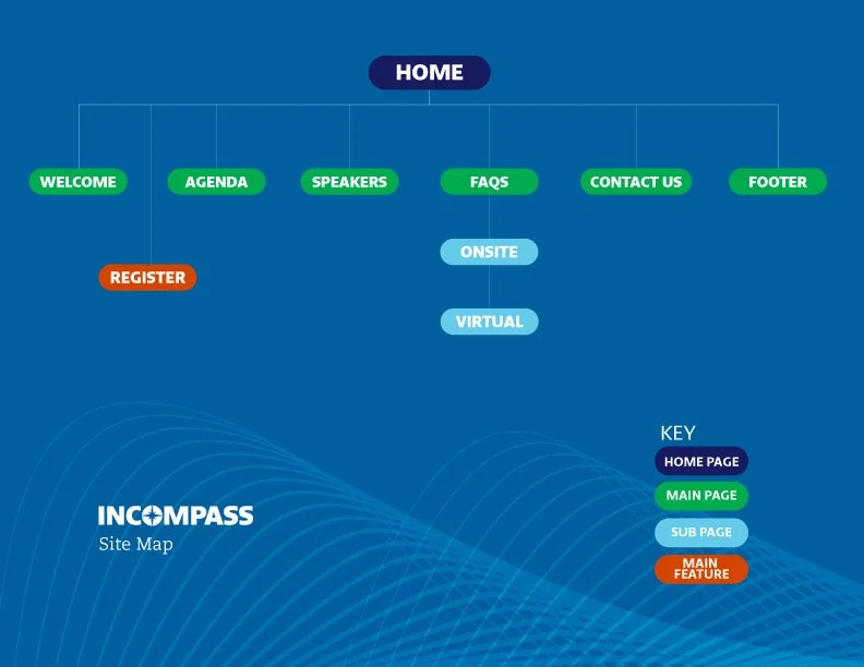
Design a website that is easy to navigate and will include all the information pertaining the event
Hand–off final high quality graphics
Tools I Used
Sketch
Figma
Adobe Photoshop
Adobe Illustrator
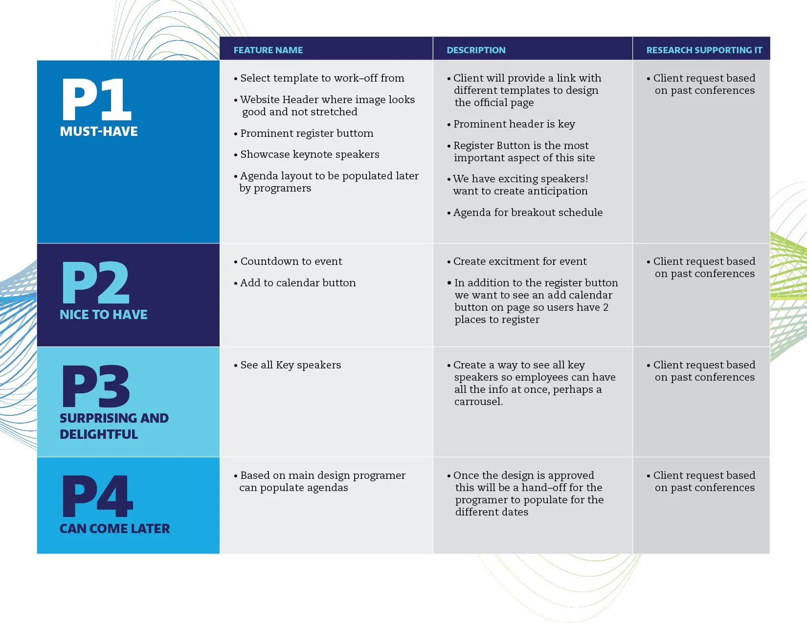
Feature Roadmap
I met with stakeholders to talk through the goals and needs for this project. Success criteria was to drive employees to register. Headcount was key for convention to make the grade. They requested a way to showcase key speakers in a fun manner and design the agenda section. Since working with a vendor to program the website I first had to select a template from their library. Once the template was approved by both Design Manager and Stakeholders, the design/ui/ux journey began! (The best part of the project). Last but not least, brand guidelines needed to be applied.
A big challenge to get this project off the ground was not having all information and elements at hand. InCompass was re-branded last year, a lot of things were built as projects were moving. In some instances I had to make–up the information to win time. For example, I didn’t know what the logo looked like until the very end, The entertainment info was given to me the very last minute. I had no images to use. The hotel where the convention took place did not provide us with images. I ended up using google images as placeholders to present my work as finished as possible, allowing the stakeholder to see as much of a final product as possible. Never a dull moment here.
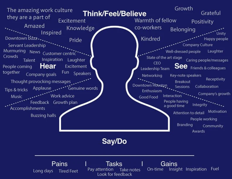
Think. Feel. Believe.
To get a feel for what the experience of this website should be, I decided to do this exercise to help me visualize the event and have that energy translate to the website.
Working at Insperity makes me a “persona”. I live and breath the culture. I felt this exercise was a better direction to take.
I decided this layout needs to be clean but with fun features that speak about the event and the brand. There is a lot of information to be taken in. The user needs to feel at ease when navigating the site, and be able to find the information as quickly as possible. I truly believe that if the design translates well to the users it will create anticipation and excitement around the event.
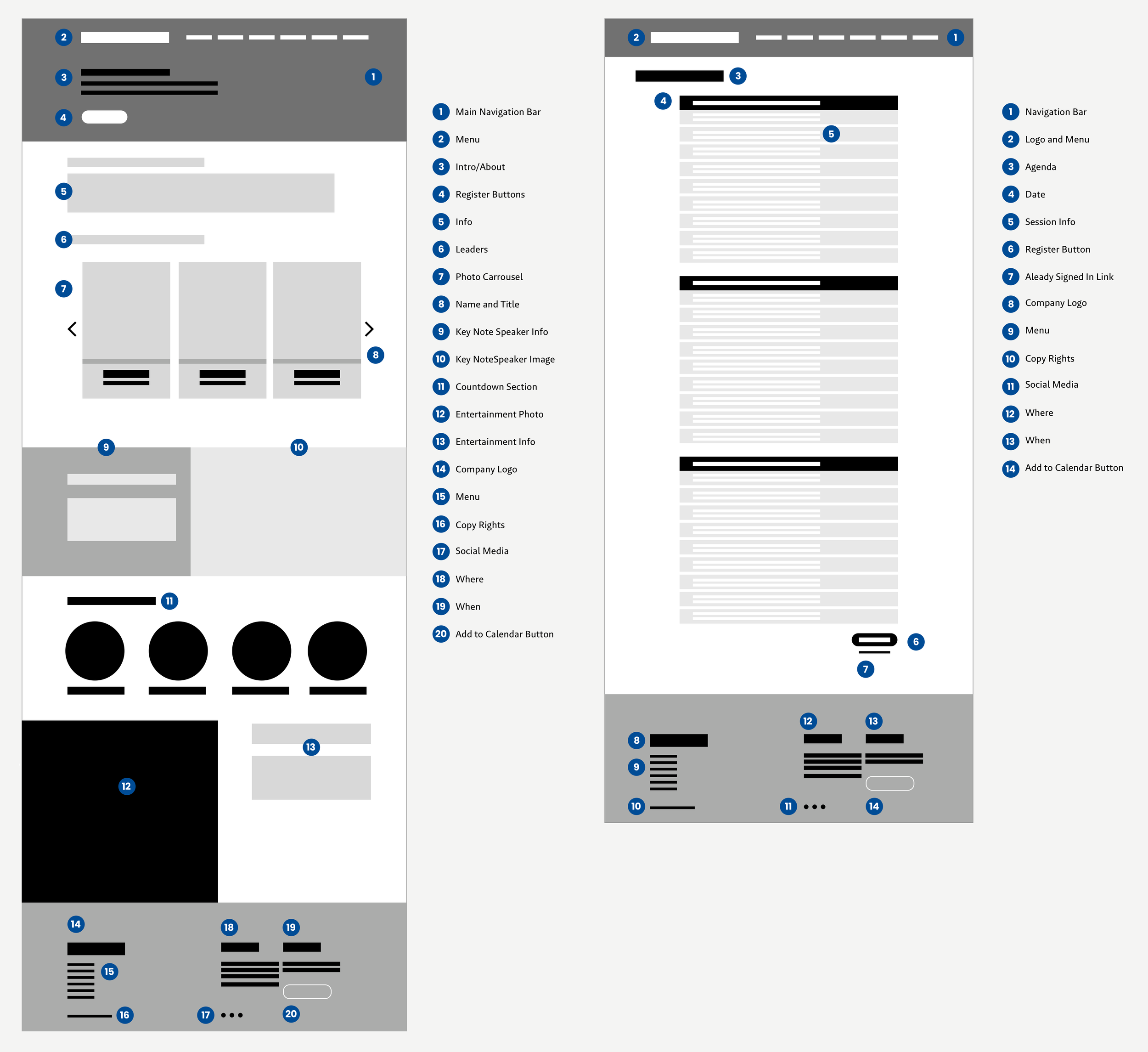
Given the rush of the project, I went directly to sketch to draft the composition of the website. Here’s where I made decisions like the position of the register button, where certain info will live, the placement of the photo carrousel and how the key speakers would be showcased. I think being a designer is like being an organizer. I love how neat and tidy the layout is.
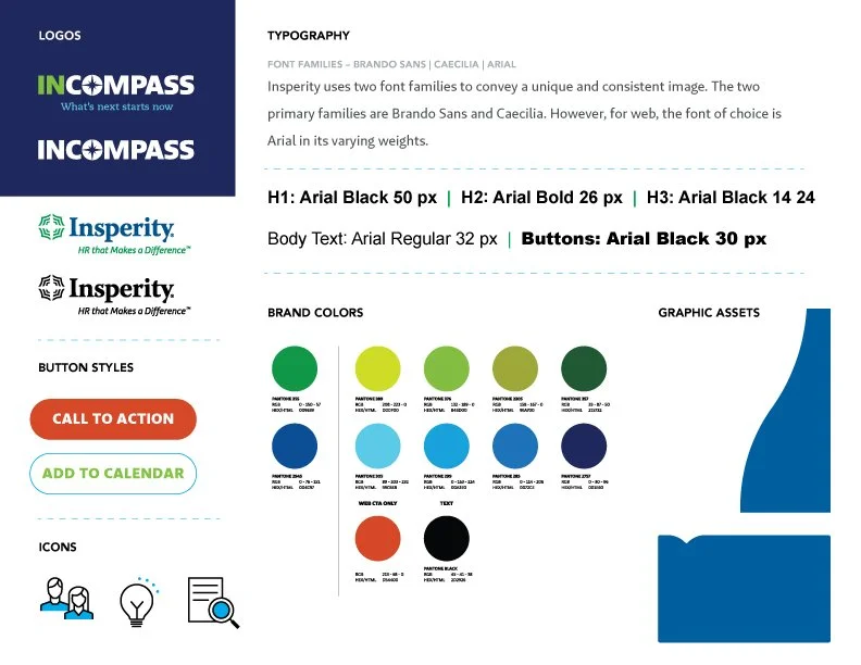
Since this project was handed out to a third party, creating a well drafted UI Kit was an essential component to end up with a successful website. I wanted to make sure everything from colors, shapes and fonts were translated perfectly!
NOTE: A prototype was not created since the website layout was only 2 pages and it went to a vendor to be programed and flushed out.
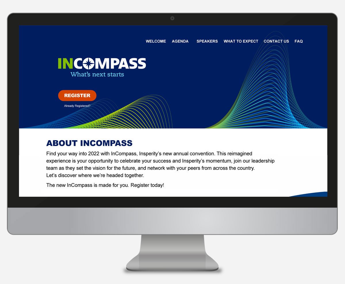
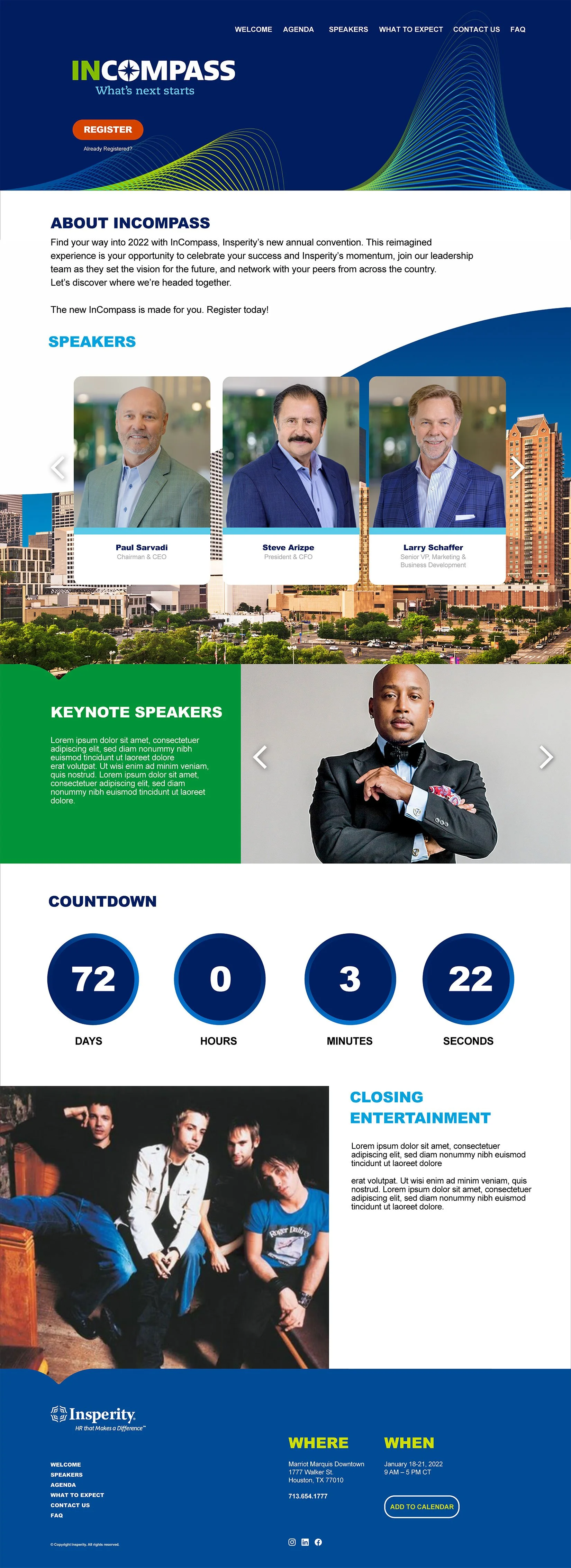
Final and Approved Website!
Summary
I was very excited to get this real–life project. I was able to apply the new knowledge and skills from design lab. The turn-around was incredibly fast. I had no bandwidth to do all the research steps I now value so much. I was also working a bit in the dark by not having graphic assets at hand. However, the project got done, and it served its purpose. The stakeholders were very happy with the result. InCompass had more than 800 in-person attendees and 1,000+ enjoyed the event from their comfort of their homes. All of whom got registered through this website. It feels good to make a positive contribution to a company that offers so much good to its employees and communities.
Metrics
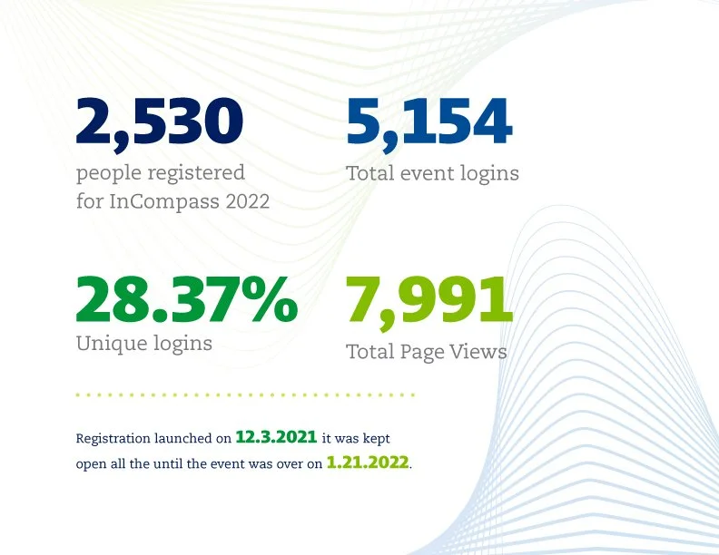
*Metrics provided by vendor after event ended.

